34 Trends That Will Define Home Design In 2020
Kitchens
1. Three-tone kitchens. Two-tone kitchen cabinets — meaning the upper cabinets are one color and the lower cabinets another color, or the perimeter cabinets are one color and the island is a different color — dominated kitchens in the past couple of years. So it’s only natural that designers are building on the trend rather than doing away with it.
In a three-tone kitchen, one more color or material is introduced to create an asymmetry in the palette that helps define zones or functions and keeps the eye moving.
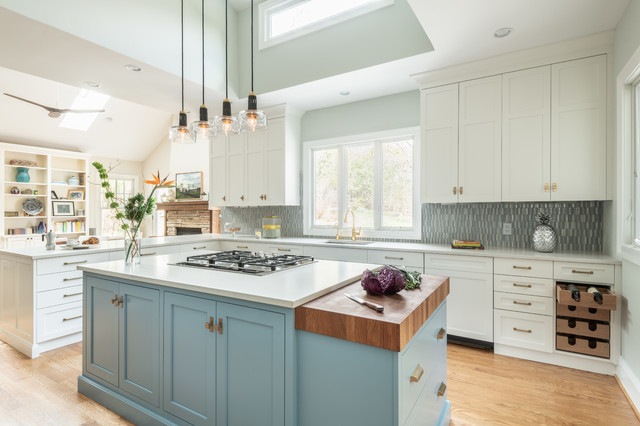
Here, designer Janina Cabrera of J Style at Home designed a gorgeous kitchen with white perimeter cabinets, a light wood island base and a knockout powder-blue hutch.
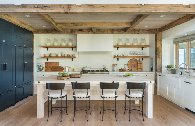
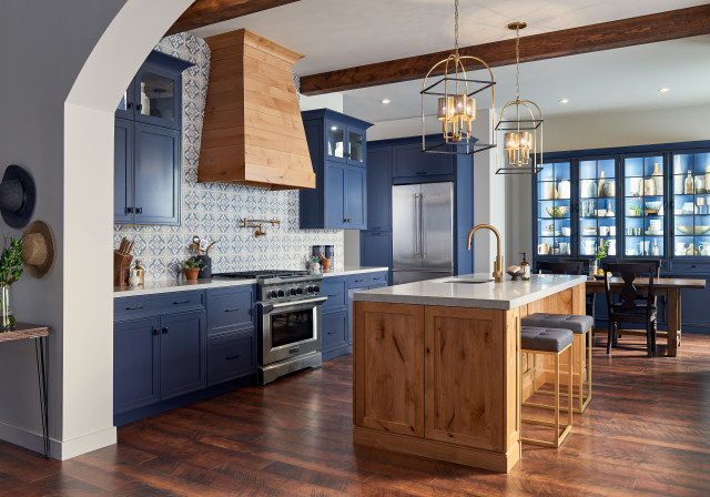
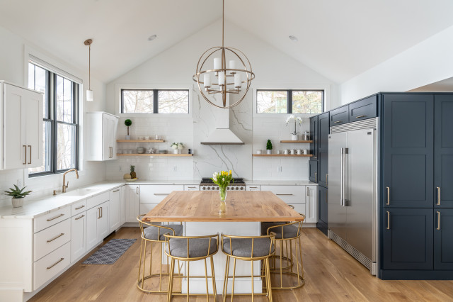
In this kitchen by Hutker Architects, a deep navy defines the refrigerator and pantry wall to the left, joining white perimeter cabinets and a superlight wood island base. Wood via the beams, ceiling, shelves and flooring adds to the diverse three-tone palette.
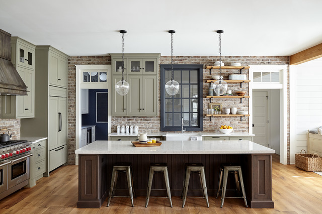
Designer Lisa Furey used a three-tone strategy in this kitchen, which is one of the most popular kitchen photos uploaded to Houzz in 2019. Sage-green cabinets surround a dark stained wood island base, while an inky painted window frame (Wrought Iron by Benjamin Moore) punches up the design considerably.
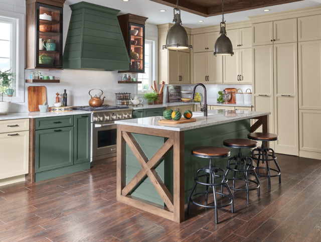
This cabinetry from Yorktowne combines a honeyed white (Safari Classic) with green (Eucalyptus Classic), and two warm wood cabinets with open shelves flank the range. A wood X-detail contributes to the three-tone approach.
2. Refaced cabinets. Keeping the cabinet boxes while replacing the drawer and door fronts is an affordable way to dramatically update a kitchen, and it’s an idea homeowners will increasingly turn to.
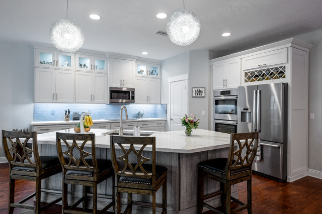
Here, Kitchen Magic, which specializes in cabinet refacing, enhanced midtone oak cabinets to create a refreshing kitchen with the same layout as the former kitchen.
Here, Kitchen Magic, which specializes in cabinet refacing, enhanced midtone oak cabinets to create a refreshing kitchen with the same layout as the former kitchen.
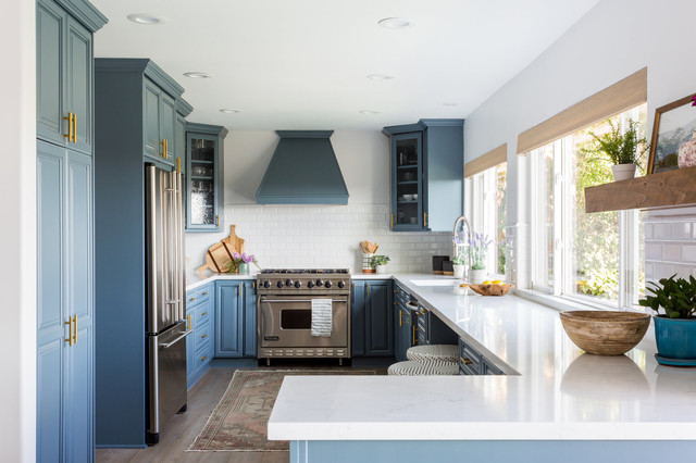
Palisades Kitchen & Bath refaced the existing light-oak cabinets in this Los Angeles kitchen, making them a beautiful deep blue (St. Bart’s by Sherwin-Williams).
3. Blue cabinets. Speaking of blue cabinets, interior designer and color expert Jennifer Ott predicts that the color will catch on even more in 2020. “Both black and navy continue to be popular, and I anticipate seeing them used in even larger doses in 2020, such as for all of the kitchen cabinets rather than just the base cabinets or island,” she says. “To balance out these dramatic darks, I’m seeing equally liberal use of neutral to warm whites, such as wool and bone white. These are whites that have just the slightest touch of warmth to them, which keeps them clean and crisp-looking.”
Even the Pantone Color Institute picked Classic Blue as its 2020 Color of the Year.
Even the Pantone Color Institute picked Classic Blue as its 2020 Color of the Year.
4. Wood cabinets. As you’ll see, wood features heavily throughout this article, and we seem to be on the cusp of a renaissance of full-wood kitchen cabinets. Perhaps it’s a reaction to past years of mostly white and gray palettes, but some credit must be given to designers, artisans and cabinetmakers who have shown their clients how rich and diverse various woods and grain patterns can be.
If there’s one wood that might outshine them all in 2020, it’s walnut. Walnut is such a naturally rich, warm, elegant and inviting wood, which makes it perfect for lively kitchens. Walnut pairs beautifully with whites, grays, blues and brass tones — all popular colors in modern-day kitchens. So it’s no wonder that designers and homeowners like it.
Designer Bobbi Alderfer of Lifestyle Design used walnut cabinetry in this Illinois kitchen. “Its finish color, construction and simplicity made it the natural choice for this kitchen overhaul,” she says.
Designer Julie Deuble used maple cabinets in a clear-coat finish to bring lightness to this kitchen in Buffalo, New York.
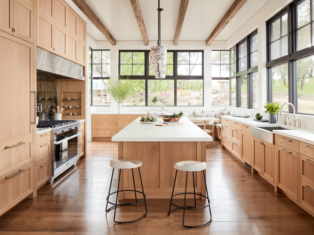
An abundance of white oak cabinetry by RMS Designs makes for a warm and inviting kitchen that complements the wooded outdoors, visible through the large windows of this home built by Total Concepts.
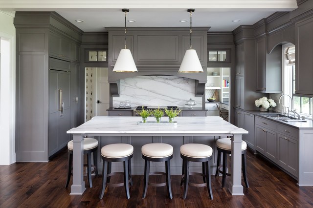
5. Soft-colored kitchens. One word that defines a lot of the palettes of popular kitchens in 2019 is “soft.” In this Boston kitchen by Windhill Builders, soft gray cabinets (Light Pewter by Benjamin Moore) join soft satin-brass fixtures, a light marble backsplash and quartzite countertops for a refreshing look.
Backsplashes
6. Slabs. If the thought of grout lines gives you pause, or you’ve hit analysis paralysis when trying to choose a backsplash tile, consider taking your countertop material one step further. A slab backsplash, especially in a material with lots of movement, makes for an eye-catching design statement.
6. Slabs. If the thought of grout lines gives you pause, or you’ve hit analysis paralysis when trying to choose a backsplash tile, consider taking your countertop material one step further. A slab backsplash, especially in a material with lots of movement, makes for an eye-catching design statement.
You don’t always have to match the backsplash slab with the countertop. In this kitchen by RD Architecture, a stunning slab of Italian granite called Black Horse was the first thing the homeowners purchased before remodeling their home. The granite is like a large piece of abstract art.
7. Mixing matte and glossy tile. If you’re looking for a subtler backsplash option, consider mixing up the finishes of your tile selection. This range wall backsplash is made up of 2-by-8-inch tiles, two-thirds of which have a matte finish; the remaining third have a glossy finish, creating a subtle visual contrast.
Countertops
8. Porcelain. While engineered quartz will continue its rise in popularity as a countertop material (51% of renovating homeowners choose the material, according to the latest Houzz research), some designers are looking for alternatives that deliver a more polished look with the same durability.
Designer Tom Johnson of Hyde Park Renovations is excited about porcelain slabs, which he used for the island in the kitchen shown here. “With porcelain you get very vivid patterns while still sharing stain- and heat-resistant qualities that make quartz so popular,” he says.
For this Houston kitchen, Michele Merz of MMI Design used porcelain that mimics the look of Calacatta Gold marble but without the maintenance. Merz says porcelain is comparable to quartz but is slightly more expensive. When it comes to the look of veining, she says, porcelain does a better job. “Veining in quartz tends to look very digitized,” she says. “It’s getting better, but porcelain veining looks more natural.”
9. Quartzite. As granite continues to decline in popularity, according to recent Houzz research, quartzite seems to be rising. The natural stone is harder than granite and displays infinite variation, meaning no two slabs ever look the same. It’s also super heat-resistant and more scratch-resistant than engineered quartz.
This kitchen, which was the most popular one uploaded in 2019, features a dramatic Florida quartzite island countertop.
This kitchen, which was the most popular one uploaded in 2019, features a dramatic Florida quartzite island countertop.
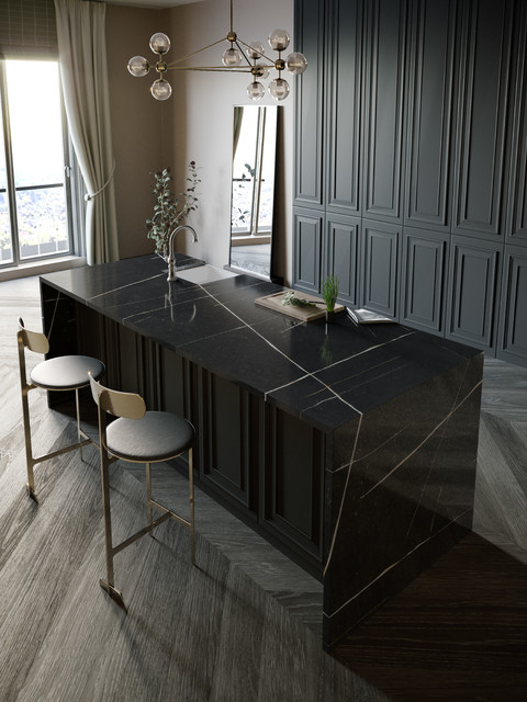
10. Dark colors. As Houzz editor Erin Carlyle reports, several countertop manufacturers showed off dark countertop options at the Kitchen & Bath Industry show in early 2019. Cosentino introduced Eternal Noir, an engineered quartz in rich black with warm white and gold veining, shown here. Homeowners and designers looking for a contrast to white cabinetry or a complement to dark cabinetry will turn to these darker countertops.
11. Butcher block or other wood countertops. If you’re choosing a countertop material for an island that’s different than your perimeter countertops, consider butcher block or a wood slab. Recent Houzz research reveals that among renovating homeowners who want a contrasting island material, 41% choose butcher block or a wood slab, followed by a distant 28% who choose engineered quartz.
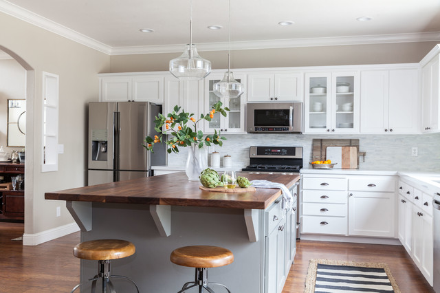
For this kitchen in Saratoga Springs, New York, the homeowner built the wood-top island.
For this kitchen in Saratoga Springs, New York, the homeowner built the wood-top island.
In this kitchen by Juxtaposed Interiors, a walnut butcher block island countertop adds warmth to refaced white cabinets.
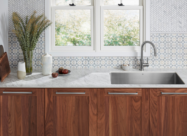
12. Ultrathin materials. Also at the Kitchen & Bath Industry Show earlier this year, many companies introduced technology that allows for thinner engineered countertops.
Wilsonart introduced ultrathin countertops in a range of designs: stone and quartz looks as well as wood-look and steel patterns. The European-inspired ultrathin surfaces, one of which is shown here, are one-half-inch thick and can be installed with an undermount sink. The material is a new composite made of resins and paper.
Wilsonart introduced ultrathin countertops in a range of designs: stone and quartz looks as well as wood-look and steel patterns. The European-inspired ultrathin surfaces, one of which is shown here, are one-half-inch thick and can be installed with an undermount sink. The material is a new composite made of resins and paper.
Personalized Features
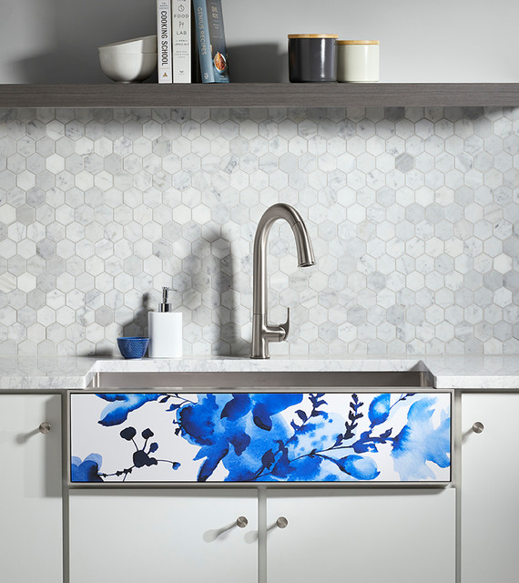
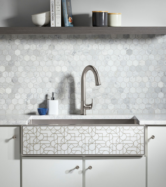
13. Decorative sink panels. The age of customization is upon us. Many home design companies are rolling out appliances and other features that allow homeowners to choose personalized colors and patterns, or that allow them to easily swap out decorative features to instantly update a fixture.
Earlier this year Kohler introduced its Tailor customizable farmhouse sink (shown here), which has a changeable decorative front panel. Homeowners can choose one of Kohler’s six decorative panels, which include floral and geometric. This panel is called Light Floral. Alternatively, customers can insert their own material, like a countertop material or tile, into the panel slot.
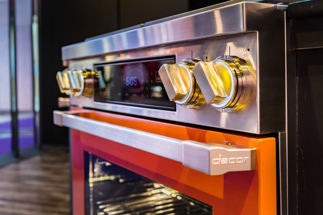
14. Custom-colored appliances. Also earlier this year, Dacor launched its DacorMatch Color System, which allows homeowners to get the company’s Heritage ranges and wall ovens in any color they choose. That way the range can match a cabinet color or a color found in a backsplash tile mosaic, or even the color of a homeowner’s favorite sweater.
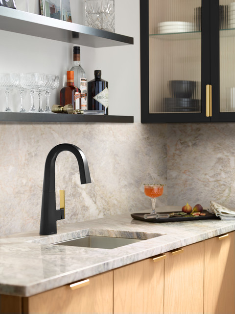
15. Mixed metal finishes on faucets. Moen’s Nio faucet, shown here in matte black, comes with the option of a different handle finish, such as brushed gold (shown in this photo), chrome, stainless steel and black stainless steel.
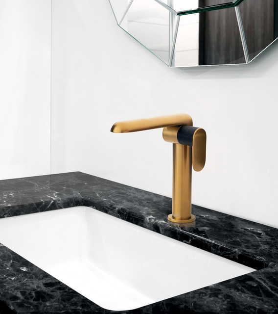
Riobel’s Ciclo faucet comes in chrome, brushed chrome, matte black or brushed gold. Homeowners and pros can choose to match the handle to the faucet body or select an accent color instead.
Wood Accents
16. Wood detailing on range hoods. As mentioned earlier, wood is showing up in full force in kitchens. One interesting way wood is being used in kitchens is as a detail on a paneled range hood, as shown here.
16. Wood detailing on range hoods. As mentioned earlier, wood is showing up in full force in kitchens. One interesting way wood is being used in kitchens is as a detail on a paneled range hood, as shown here.
A wood detail on a range brings in a bit of warmth and texture, and helps break up large expanses of white or gray cabinetry.
Notice the beautiful slab backsplash in this kitchen as well.
Notice the beautiful slab backsplash in this kitchen as well.
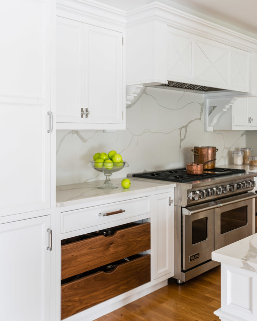
17. Wood cabinets amid painted cabinets. Another way designers are bringing a dose of warm wood to white cabinets is by using wood for just a few drawers or cabinet fronts. Again, it helps break up the large expanses of white or another color and introduces texture and warmth.
Here, walnut pullouts for pots and pans do the job of bringing a bit of cozy contrast to the frosty white cabinets and marble-look quartz countertops. Note also that the quartz-slab backsplash matches the countertop.
Here, walnut pullouts for pots and pans do the job of bringing a bit of cozy contrast to the frosty white cabinets and marble-look quartz countertops. Note also that the quartz-slab backsplash matches the countertop.
Here, vertical wood pullouts flanking the range help offset the white cabinets and complement the range hood.
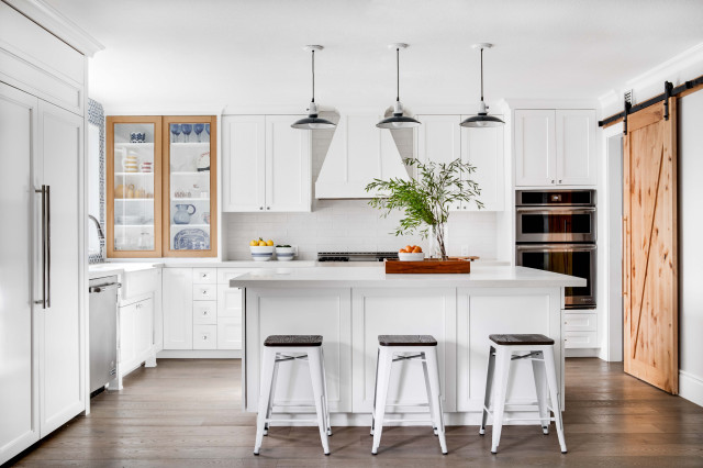
Nate Fischer Interiors used wood to frame the glass-front cabinets in this Orange County, California, kitchen. A large natural wood barn door also helps break up all the white.
Islands
18. Multifunctional island centers. Kitchen islands are nothing new, but they certainly are evolving. We’re seeing many homeowners take islands beyond just storage. And as we’ll see, islands are getting bigger and are taking on more function. Nearly a third of renovating homeowners who are updating their island will add a microwave and a dishwasher, according to the latest Houzz research. A quarter of them will add a garbage disposal, and more than a fifth will add a cooktop.
That means islands are becoming multifunctional hubs in the kitchen, allowing various zones for cooking, prepping and cleaning. And it makes sense for the person in the kitchen performing all the main tasks to be facing the island, at which guests and family might be sitting, rather than the perimeter walls.
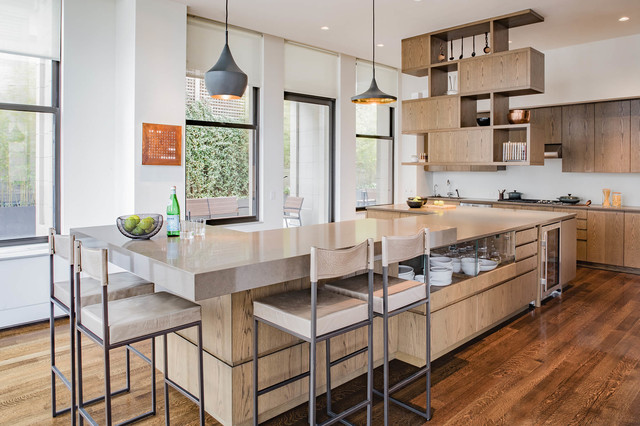
The island shown here, by designer Adriana Solmson, includes a bar-height zone for sitting, a prep zone, a cooking zone, dish storage and a beverage fridge.
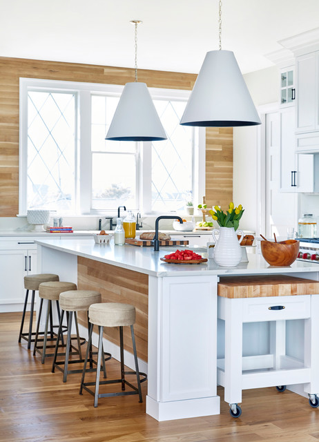
19. Hardworking ends of islands. Similarly, the ends of islands are taking on more function. Numerous kitchens on Houzz in 2019 pack in things like a pullout chopping station, shown here in a kitchen by Toledo Geller.
Beverage fridges are popular end-of-island features because they allow guests or family members to grab a drink without disrupting the cook in the kitchen.
20. Wood islands. Again, wood is showing up everywhere in kitchens. While the latest Houzz research shows that renovating homeowners who are upgrading their island and choosing a contrasting cabinet color will select a gray (26%), blue (19%) or black (11%) island, wood islands are becoming popular. In fact, the choice of a medium-tone wood island by homeowners matches that of black (11%).
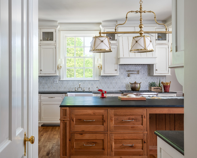
Jennifer Gilmer Kitchen & Bath incorporated a beautiful midtone wood island into this Virginia kitchen to help anchor the room and warm up the white cabinets, cool blue backsplash tile and dark countertops.
Jennifer Gilmer Kitchen & Bath incorporated a beautiful midtone wood island into this Virginia kitchen to help anchor the room and warm up the white cabinets, cool blue backsplash tile and dark countertops.
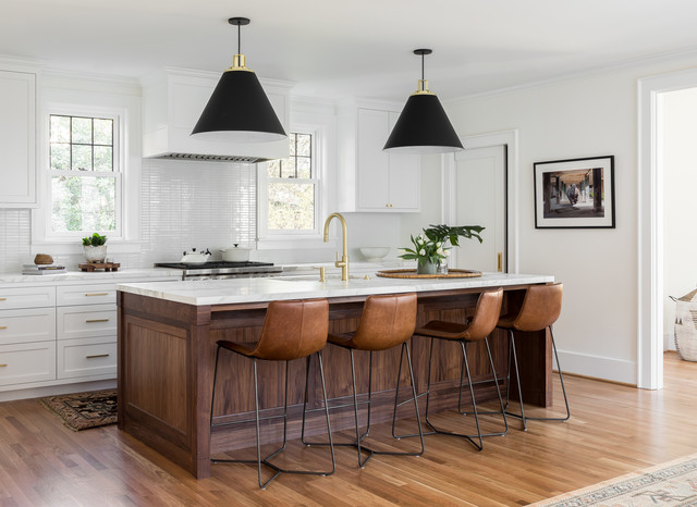
Here, Casework in Portland, Oregon, used a large walnut island to complement the oak flooring and warm up the marble countertops, white cabinets and glossy white tile backsplash.
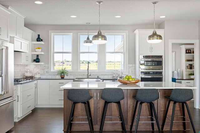
Here, Janelle Rasmussen of the Interior Transitions Group of Robert Thomas Homes incorporated a walnut island in a desert sand stain. (Note the use of walnut in this and the previous kitchen as examples that walnut is becoming a go-to wood species for kitchen cabinets.)
21. Extra-large islands. As we asked earlier this year, at what size does an island stop being an island and become a continent? It’s a tough call, but the latest Houzz research shows that nearly a third of renovating homeowners who are upgrading their kitchen island make it more than 7 feet. (That means the average NBA center player could lie down comfortably on it!)
“Many of our clients are doing away with kitchen tables and opting for super-large islands,” designer Katelyn Gilmour of KBG Design says. “That way family and guests can be close by or dine informally while still gathering together in the kitchen.”
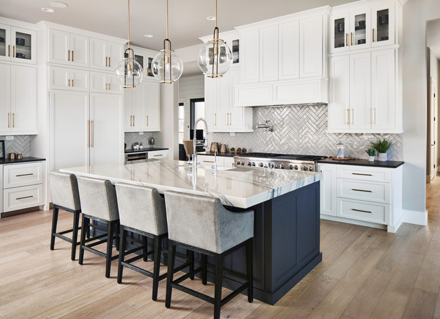
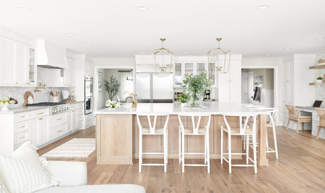
In this Los Gatos, California, kitchen, Gilmour created a supersize island with a light wood base, a marble-look quartz countertop and seating for six. (Again, note the use of wood as the island base.)
22. Oversize statement pendants. “I think we will reach peak ‘statement light fixture’ by 2020,” designer Jennifer Ott says. “It’s been building for years now and is culminating with homeowners’ now wanting rooms designed around these light fixtures that are basically works of art themselves. Large, impactful pendants in particular are all the rage.”
Bathrooms
23. Tiled bathtub aprons. Tile is a great, affordable material that adds design points to a bathroom, and ordering a few extra square feet of tile likely won’t sink the budget. That’s why we’re seeing many homeowners and designers covering the tub apron in tile or another material, like wood. This results in a big payoff with a minimal investment.
Dvira Interiors used mini marble mosaic tile on every surface in this Toronto bathroom to help integrate all the angles.
Tile isn’t the only option. Designer Clara Jung of Banner Day Interiors applied a custom wood apron to help make this small bathroom stand out.
In this San Francisco bathroom by Milieu Interior Design, large-format tile on the tub apron matches the shower wall tile for a sophisticated, dramatic design.
24. Walk-in showers. This might seem like a no-brainer, but the desire for a walk-in shower seems like it has reached a fever pitch. Some of our most popular articles of 2019 are about walk-in shower ideas. Many homeowners want big showers that are easy to get into and out of, and because showers are the tallest element in a bathroom, figuring out how to make them stand out and look good is a common concern.
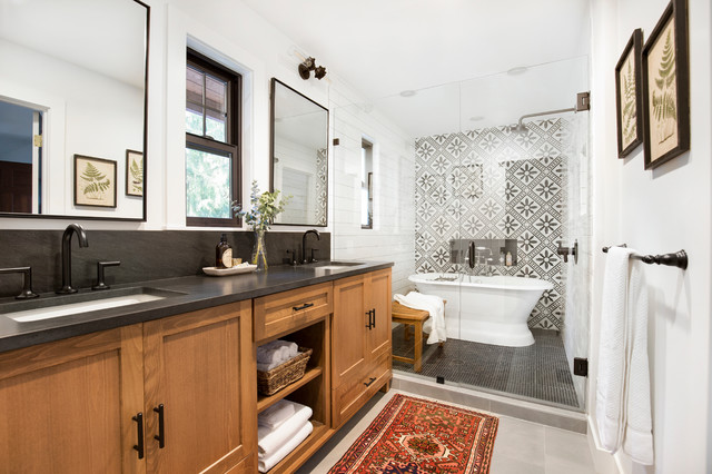
Here, matte black fixtures, graphic floor tiles and industrial lights above the vanity make for a sleek and stylish bathroom in Denver.
Here, matte black fixtures, graphic floor tiles and industrial lights above the vanity make for a sleek and stylish bathroom in Denver.
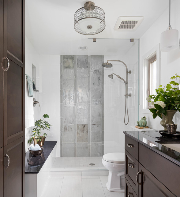
A bathtub was sacrificed to make room for this streamlined shower with a floor-to-ceiling glass partition that makes the ceiling seem higher.
Black wall tile measuring 12 by 24 inches in a straight-lay pattern with black grout in the shower, combined with a partial glass door framed in black metal, gives the room a bold look.
Black wall tile measuring 12 by 24 inches in a straight-lay pattern with black grout in the shower, combined with a partial glass door framed in black metal, gives the room a bold look.
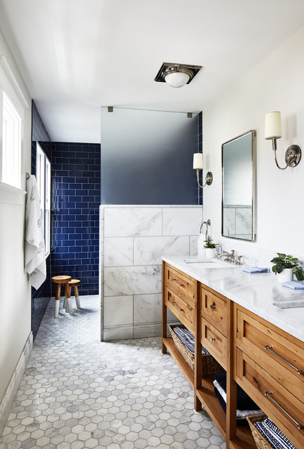
25. Wet rooms. Putting a stand-alone tub in an enclosed shower area makes sense. Why not contain all the functions that cause splashing in one space? Cue the rise of the wet room. If you’ve got the space, consider this practical approach to laying out the bathroom.
26. Shower ledges. Many designers feel that installing a shower ledge is more straightforward than installing a niche, because a ledge requires only building out a few inches into the shower space instead of carving out space between studs. Run your ledge along the length of your shower stall, as designer Katy Popple did here, and you’ll have tons of space for shower essentials.
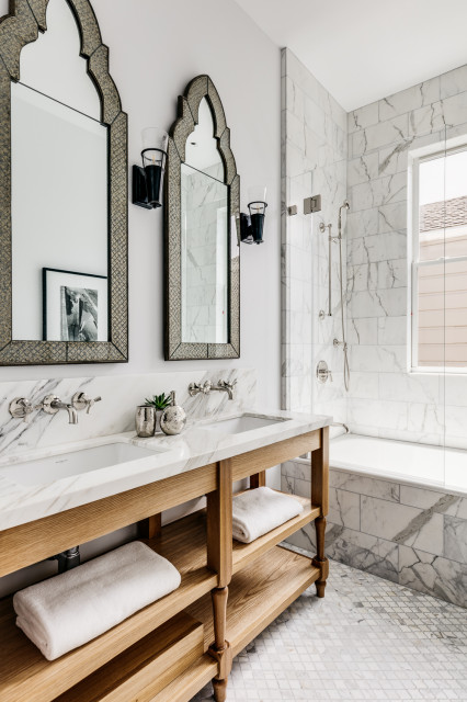
27. Floating double vanities. We’re seeing a rise in popularity of double floating vanities among the Houzz community. And it’s easy to see why. Floating a vanity frees up floor space to give the appearance of more room, and makes cleaning the floor easier than with a furniture-style vanity with legs that can trap dust.
28. A seat in the bathroom that’s not the toilet. Whether for brushing teeth, taking off house slippers or just idling away on the internet, a place to relax in the bathroom is something almost every homeowner could benefit from having. In bathrooms on Houzz, we’re seeing seating pop up as everything from built-in benches to stools that provide versatility.
Designer Kristine Tyler of Treefrog Design designed the bench that runs from the armoire into the shower stall in the bathroom seen here, giving the homeowners a seat outside of the shower as well as in it.
29. Fully wrapped powder rooms. Going for bold style in a powder room is nothing new. Designers tend to like to go a little wild in these small spaces often used by guests. One way to go big or go home is by wrapping the entire powder room in a feature wallcovering.
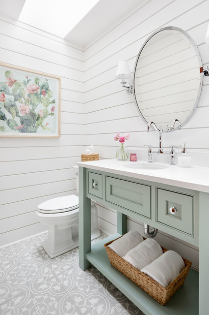
Designer Kimberlee Gorsline of Kimberlee Marie Interior Design wrapped this popular powder room in white shiplap to create a textured backdrop for the mint-green vanity and patterned ceramic tile floor.
Designer Kimberlee Gorsline of Kimberlee Marie Interior Design wrapped this popular powder room in white shiplap to create a textured backdrop for the mint-green vanity and patterned ceramic tile floor.
Living Rooms
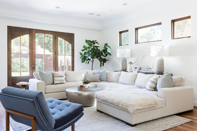
30. Breezy, calming living rooms. One thing we heard designers talking a lot about this year, particularly at Design Chicago, is the need to design around a sense of calm and wellness. We’re seeing that manifest in soothing and relaxed living room designs. Soft colors, casual fabrics, minimal decor and lots of sunshine hit the note just right, as seen in this Santa Monica, California, living room by Irene Lovett of designstiles.
30. Breezy, calming living rooms. One thing we heard designers talking a lot about this year, particularly at Design Chicago, is the need to design around a sense of calm and wellness. We’re seeing that manifest in soothing and relaxed living room designs. Soft colors, casual fabrics, minimal decor and lots of sunshine hit the note just right, as seen in this Santa Monica, California, living room by Irene Lovett of designstiles.
Laundry Rooms
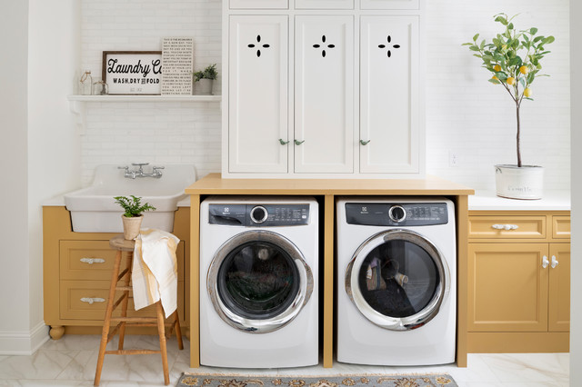
31. Deep utility sinks. One thing that keeps coming up again and again in 2019 laundry room photos is a large country or farmhouse utility sink, like the one shown in this laundry room by Sarah Martin of Beautiful Chaos.
If you use a sink to presoak lots of clothing items, such as dirty sports gear for your kids, a deep and wide sink with a wall-mounted faucet is perfect for getting the job done. Plus, the design adds a little charm.
This Boston laundry room by Kelly McGuill Home, which happens to be the most popular laundry room uploaded to Houzz in 2019, also incorporates a farmhouse sink.
32. Bright colors. Designers have long championed making laundry rooms enjoyable spaces to be in. After all, if you have to do laundry, you might as well be in a pleasant atmosphere. But lately we’re seeing designers and homeowners take that idea even further. They’re introducing energizing colors, patterns and features to transform these spaces into enjoyable rooms, making them lively, cheerful and a bit quirky.
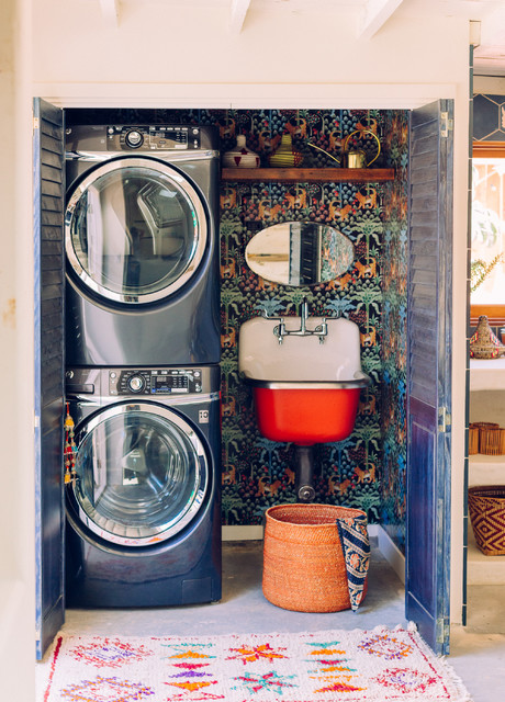
Blue appliances, blue doors, a red sink and vibrant wallpaper give this compact Los Angeles space by New Generation Home Improvements fun bohemian style.
Blue appliances, blue doors, a red sink and vibrant wallpaper give this compact Los Angeles space by New Generation Home Improvements fun bohemian style.
Dining Rooms
33. Dining rooms with personality. While many family meals are had at informal spots near or in the kitchen, dining rooms are thriving for special occasions. That specialness opens up opportunities to inject lots of personality through color, pattern, lighting and more that might not fit within the context of the style found elsewhere in the home, and we expect to see more designers doing just that in 2020.
Sara Malek Barney and Mackenzie Wood of Bandd Design created this sophisticated dining room in Austin, Texas, which features a brass chandelier, custom jade-colored drapes and feather-print wallpaper. Eight dining chairs with dark gray upholstery and metal legs surround the authentic Saarinen Tulip table.
Colors
34. Warmer colors. While neutrals are still very popular in general, on Houzz we’re starting to see people move away from grays and head toward warmer colors, from coral in all shades to ocher and beyond.
“Millennial Pink, so popular three or four years ago, is back, but the current incarnation is warmer — a very light coral,” designer Jennifer Ott says. “Another popular color trend is bringing together warm and cool colors in unexpected combinations, such as hot pink with pistachio green or soft coral with a bright mint.”




















Comments
Post a Comment