Beige Is Back In Design
In recent years, the color gray soared in popularity while warm neutrals like beige got a bad rap. Beige, which often has been preceded by the word “boring,” deserves better, and it’s making a comeback. At recent design shows such as Maison & Objet, High Point Market and the Atlanta International Gift & Home Furnishings Market, earthy and warm neutral tones like beige, khaki, tan and greige (a mix of warm gray and beige) were paired with trends such as nature-inspired looks and designs that promote wellness.
Designers have always known that the right shade of beige can embrace you like a warm and calming hug. Here, several of them share 10 of their favorite warm neutral paint colors, which you can see in the accompanying room photos.
Designers have always known that the right shade of beige can embrace you like a warm and calming hug. Here, several of them share 10 of their favorite warm neutral paint colors, which you can see in the accompanying room photos.
Accessible Beige, Sherwin-Williams
There really couldn’t be a better paint name to kick off this story. Accessible Beige sounds so democratic — a beige for everyone.
“This has been a go-to for designers for the past five years or so,” says Bill Petkoski, owner of home-building company Cottage Home. “It’s soft, it goes with everything and it is the perfect shade of beige without being boring or blah.”
Drop Cloth, Farrow & Ball
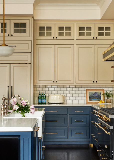
“My favorite beige these days is Farrow & Ball’s Drop Cloth,” says interior designer Emily Griffin, who designed this cozy Toronto kitchen. “It’s a great neutral and pairs beautifully with rich colors like green, blue or magenta. It is a pretty clean and simple beige that resembles a painter’s drop cloth. We did the upper cabinets in this color as opposed to doing them white. The contrast is less severe and more interesting, in my opinion.”
To complement the cabinet color, Griffin used a creamy off-white on the walls: Farrow & Ball’s Pointing.
Kilim Beige, Sherwin-Williams
Trends come and go, but St. Louis interior designer Karen Korn’s love for Sherwin-Williams’ Kilim Beige has never waned. “It is a soft neutral with earthy tendencies,” she says. “I believe gray is on the way out and we are all craving more steady and grounding colors.”
She finds that the warm neutral works well with a wide range of colors. “Kilim Beige is the perfect companion moving into the future … instead of pairing it with the reds and greens of the past, we can pair it with the blues and greens that we are seeing today, so it feels fresh and current.”
Hire a local painting company
Pashmina, Benjamin Moore
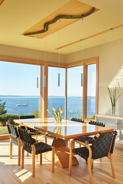
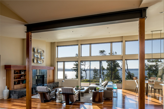
This modern home designed by architect Nils Finne has many large windows that provide panoramic views of Washington state’s Puget Sound and Olympic Mountains. The house also features thoughtful wood architectural details throughout and lots of wood furniture. “In this house, we found that Pashmina had a chameleon-like ability to take on different subtle colors in each space,” Finne says. “We liked the subtle color differences … and of course, Pashmina is warm and inviting.”
The chameleon-like quality of this sandy hue allows it to work well with a wide range of browns as well as grays.
Seashell, Cloverdale Paints
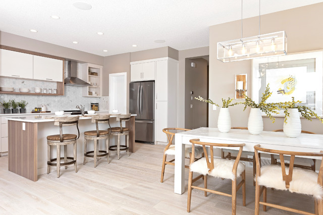
Calgary’s chilly winters inspired the use of warm neutrals in this home. Designer Kristina Hutchins chose Seashell by Cloverdale Paints to create cozy dining room comfort that’s downright hygge. “This color was chosen to enhance the two-tone kitchen, which created a warm tone to the home. The paint enhanced this feeling,” she says.
Calgary’s chilly winters inspired the use of warm neutrals in this home. Designer Kristina Hutchins chose Seashell by Cloverdale Paints to create cozy dining room comfort that’s downright hygge. “This color was chosen to enhance the two-tone kitchen, which created a warm tone to the home. The paint enhanced this feeling,” she says.
Platinum, Pratt & Lambert
Architect Dan Nelson finds that Pratt & Lambert’s Platinum helps highlight the architectural features of the homes he designs while also providing a backdrop that complements spectacular Pacific Northwest views. “To help warm up our modern houses, we use wood and earth tones like Platinum on the walls,” he says. “Many of our houses are known for being ‘warm modern’ and this color helps to achieve that goal.”
Architect Dan Nelson finds that Pratt & Lambert’s Platinum helps highlight the architectural features of the homes he designs while also providing a backdrop that complements spectacular Pacific Northwest views. “To help warm up our modern houses, we use wood and earth tones like Platinum on the walls,” he says. “Many of our houses are known for being ‘warm modern’ and this color helps to achieve that goal.”
Stone Hearth, Benjamin Moore
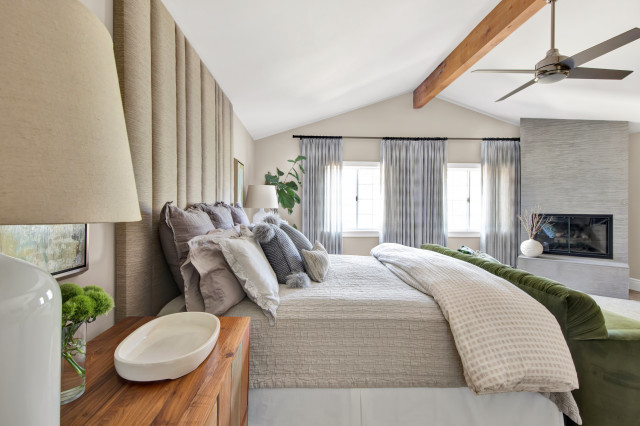
Just because beige is in doesn’t mean you have to throw out all the gray. Mixing gray and greige hues with beige can result in an inviting and calming color palette. One of Los Angeles interior designer Shannon Ggem’s current favorite beiges is Stone Hearth by Benjamin Moore, and she finds it works well with a range of gray tones.
“It’s so restful and grounded. In this serene master bedroom, we paired it with silvery grays for a ‘Siamese cat palette’ and a classic accent of emerald green,” Ggem says. “Peaceful neutrals in combination with the organic linens, natural wools and cottons used here can support client wellness practices that make their everyday life better — color selection is important.”
Revere Pewter, Benjamin Moore
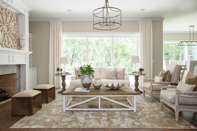
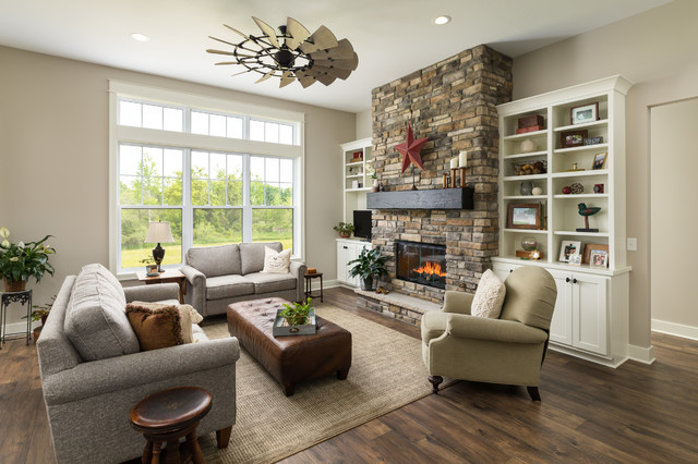
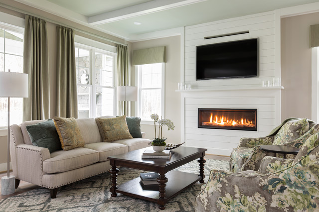
In this Grand Rapids, Michigan, living room, Benjamin Moore’s Revere Pewter, a true greige, creates a cozy ambiance. “It’s a simple color but it makes the space very inviting,” Ashley Wiborn of Snowden Builders says. “It is comforting, soft and subtle while still being neutral. Here it complements the features of the home, such as the beautiful fireplace.”
In this Grand Rapids, Michigan, living room, Benjamin Moore’s Revere Pewter, a true greige, creates a cozy ambiance. “It’s a simple color but it makes the space very inviting,” Ashley Wiborn of Snowden Builders says. “It is comforting, soft and subtle while still being neutral. Here it complements the features of the home, such as the beautiful fireplace.”
Worldly Gray, Sherwin-Williams
And Richmond, Virginia, interior designer Kathy Corbet brings up an important point: Gray is still popular with many homeowners. “Richmond is still very much on the gray trend,” she says. “Because I know it is on its way out, I have been encouraging clients to use Worldly Gray. It does read more beige but works really well with gray tones. I call it a very warm gray.”
And Richmond, Virginia, interior designer Kathy Corbet brings up an important point: Gray is still popular with many homeowners. “Richmond is still very much on the gray trend,” she says. “Because I know it is on its way out, I have been encouraging clients to use Worldly Gray. It does read more beige but works really well with gray tones. I call it a very warm gray.”
Natural Linen, Sherwin-Williams
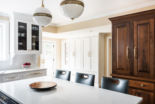
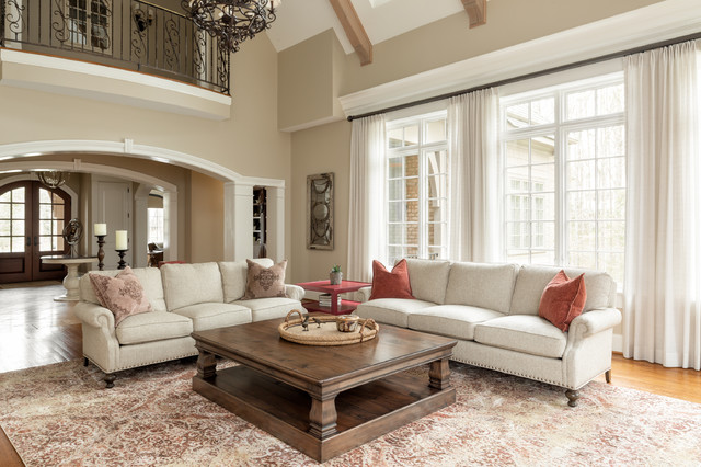
For a less greige beige, Corbet recommends another favorite of hers, Sherwin-Williams’ Natural Linen. Here you can see how well the color works with warm, spicy tones while keeping things light.
For a less greige beige, Corbet recommends another favorite of hers, Sherwin-Williams’ Natural Linen. Here you can see how well the color works with warm, spicy tones while keeping things light.
Comments
Post a Comment