5 Ways Designers Are Working With Rich Warm Tones Right Now
1. Highlight the Rich Warm Qualities of Materials
Architect John Lum likes to add rich warm tones through materials that have meaning. “For our residences, we tend to choose materials where decoration comes from the material itself, rather than applied,” Lum says. “We like having a design logic that justifies the materials so that nothing is arbitrary.”
For example, in this San Francisco home, the firm designed with a client’s collection of Eastern European furniture and his appreciation of Japanese Zen design. For Lum, this meant layering materials that would work with the two cultures. In the great room, teak wraps a stage area — from the floor up the walls and across the ceiling — while shou-sugi-ban, a blackened Japanese cypress, provides a backdrop.
While there’s meaning behind the layering, it also was an aesthetic balancing act. “The teak adds a richness to the overall interior while shou-sugi-ban provides a moody depth that references the Far East,” Lum says. The brass fireplace that both materials surround adds warmth and shine to the blackened wall. “All of the materials are beautiful by themselves,” Lum says. “Combined, they create a rich background for the eclectic art and furniture collection.”
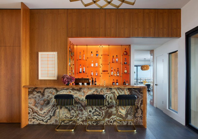
In the same home, the owner wanted the bar to have a 1970s nightclub vibe. Again, Lum layered materials with rich warm qualities to achieve the look. “Brass accents add a touch of glam, whereas the marble face on the bar gives a psychedelic energy to the entire space,” he says. “The bar’s backlit orange Chroma [a thick resin panel] backsplash evokes the feeling of a 1970s nightclub.”
Highlighting a rich warm-colored material here was quite literal, as the lighting design was carefully planned to do just that. The orange Chroma transmits light — in this case, from LED lights installed behind it. “We had a great lighting consultant who helped us with this,” Lum says. Custom brass-and-glass shelves and the glass bottles also benefit from the glow.
Highlighting a rich warm-colored material here was quite literal, as the lighting design was carefully planned to do just that. The orange Chroma transmits light — in this case, from LED lights installed behind it. “We had a great lighting consultant who helped us with this,” Lum says. Custom brass-and-glass shelves and the glass bottles also benefit from the glow.
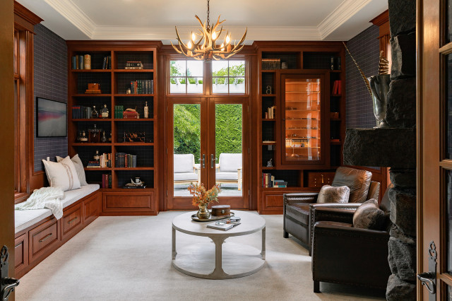
This traditionally tailored study-cigar room is quite different in style from Lum’s Bravura Modern-inspired bar. But Weihs used a similar design strategy. The warm rich tones in the room come from the inherent qualities of the mahogany she chose for the built-ins. And she used LED lights to highlight the humidor where this cigar aficionado stores his collection.
Once again, she opted for a balance of warm and cool tones in her layering. “The combination of the mahogany custom bookshelves combined with the rich navy fabric wallcovering is very luxurious and inviting,” Weihs says. “When designing a cozy, dramatic space, I always add bold contrast and rich colors, balancing out warm and cool tones.”
You can help clients visualize their planned home with Houzz Pro Mood Boards and 3D Floor Plans. You can also share photos, files, estimates, proposals and more with clients using Houzz Pro.
2. Carry Tones Through the Home
Interior designer Neela Woodard finds that repeating bold colors throughout a home is key. “Using bold colors is very client-based — some embrace it and some run in horror,” she says. “When I do go really bold and colorful, carrying colors through different rooms helps make everything feel consistent.”
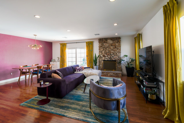
In this California bungalow’s living room, she chose a balance of warm and cool jewel tones and then repeated those colors in other spaces. For example, the deep eggplant of the wallcovering in here also shows up in the entry, the deep teals play a prominent role in the kitchen and primary bathroom, and the golden yellow tones appear again on a bedroom rug.
Interior designer Neela Woodard finds that repeating bold colors throughout a home is key. “Using bold colors is very client-based — some embrace it and some run in horror,” she says. “When I do go really bold and colorful, carrying colors through different rooms helps make everything feel consistent.”
In this California bungalow’s living room, she chose a balance of warm and cool jewel tones and then repeated those colors in other spaces. For example, the deep eggplant of the wallcovering in here also shows up in the entry, the deep teals play a prominent role in the kitchen and primary bathroom, and the golden yellow tones appear again on a bedroom rug.
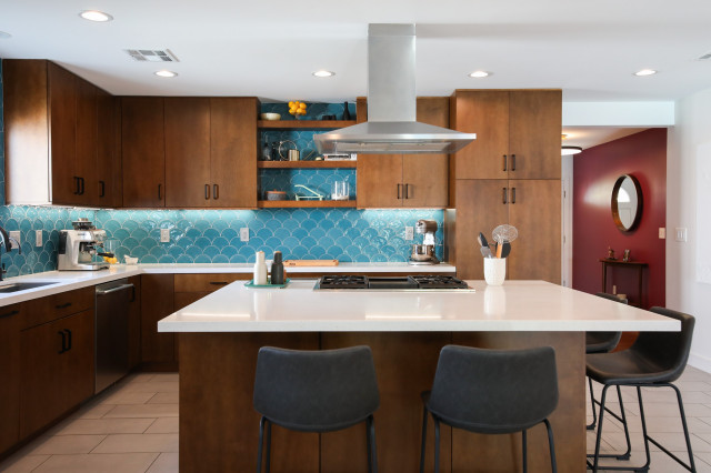
For example, the deep eggplant of the living room wallcovering also shows up in the entry and the deep teals of the living room rug play a prominent role in the kitchen, both pictured here, and the primary bathroom, and the golden yellow tones of the drapes appear again on a bedroom rug.
3. Carefully Consider the Background Color
In the same home, shades of eggplant show up in the primary bedroom. This space has a lighter palette overall, which gives it a calming vibe appropriate for a bedroom. “I also like to balance rich colors with a lot of light neutral tones,” Woodard says.
In the same home, shades of eggplant show up in the primary bedroom. This space has a lighter palette overall, which gives it a calming vibe appropriate for a bedroom. “I also like to balance rich colors with a lot of light neutral tones,” Woodard says.
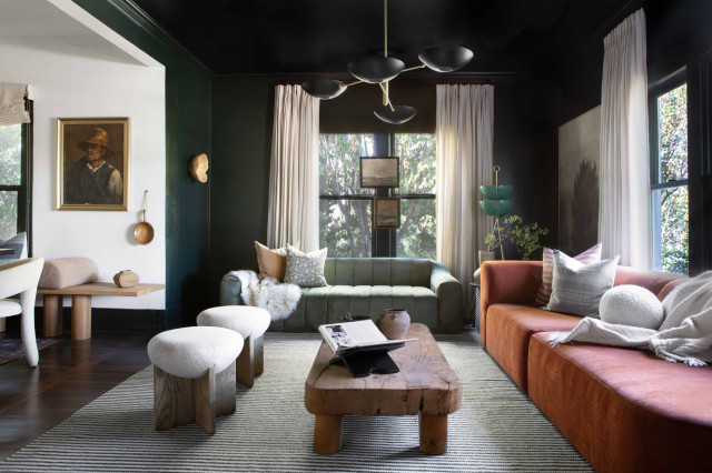
Designer Ginger Curtis wanted to use a short-term rental house as a design laboratory. Her signature style often highlights warm neutrals with high contrast, but here she wanted to experiment with color palettes she had less experience using.
“In the living room, I wanted to experiment with greens and rust,” she says. These furniture color choices inspired the use of a dark paint on the walls — Black Forest Green by Benjamin Moore. “Those sofas would have looked completely different with a white backdrop,” Curtis says.
“In the living room, I wanted to experiment with greens and rust,” she says. These furniture color choices inspired the use of a dark paint on the walls — Black Forest Green by Benjamin Moore. “Those sofas would have looked completely different with a white backdrop,” Curtis says.
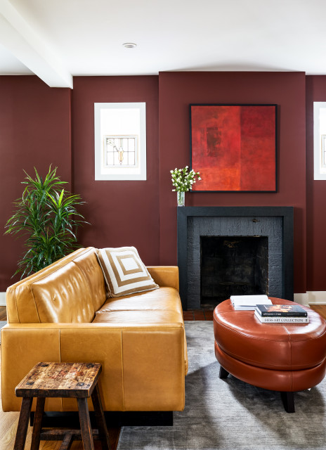
In this living room by Winn Design + Build, the color palette looks as if it was pulled straight from a spice drawer. Deep rich red-brown paint (Chestnut by Benjamin Moore) warms the walls and sets the tone. “Dark paint colors don’t always make a space feel small,” designer Jennifer Hall says. “Done strategically, they can even brighten a room, giving it character.”
Similar to the previous room, the wall color here completely transforms the way the colors on the furniture pop. The mustard yellow sofa and deep caramel ottoman work in concert with the deep chestnut walls. Meanwhile, grays on the rug and fireplace cool things down just enough, and white ceilings and trim provide crisp contrast.
Similar to the previous room, the wall color here completely transforms the way the colors on the furniture pop. The mustard yellow sofa and deep caramel ottoman work in concert with the deep chestnut walls. Meanwhile, grays on the rug and fireplace cool things down just enough, and white ceilings and trim provide crisp contrast.
4. Balance Warm and Cool Tones
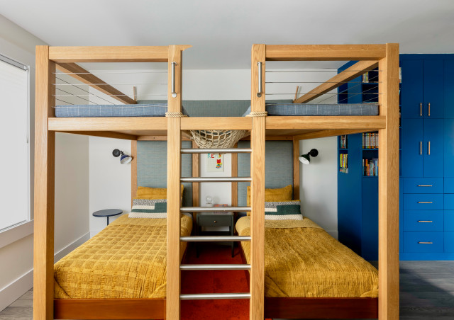
The warm honey tones of the oak in this custom loft were a jumping-off point for Weihs. The gold tones in the bedding play off the tones in the wood, while a deep spicy orange on the rug turns up the heat.
But it wasn’t all about warm tones. Weihs also adorned the beds with greens and gray-greens. And she chose a deep blue for the adjacent cabinets and shelves. This added balance to the color palette.
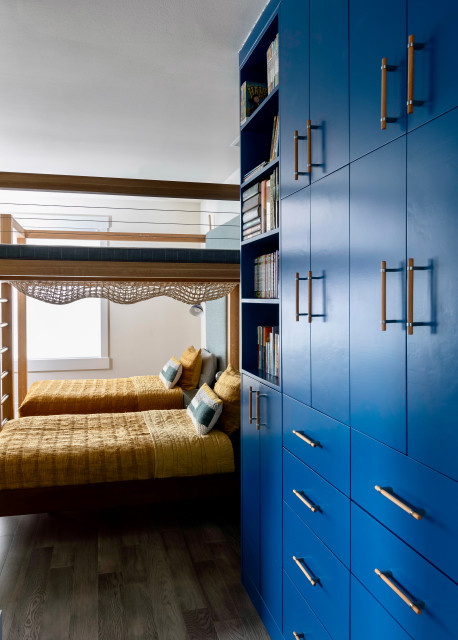
“I almost always mix warm and cool tones to add interest and depth to any space,” Weihs says. “By adding variations of the natural oak’s warm tones through bedding, it adds warmth to the cooler grays and blues in the custom cabinetry and upholstery.”
5. Pay Attention to Undertones
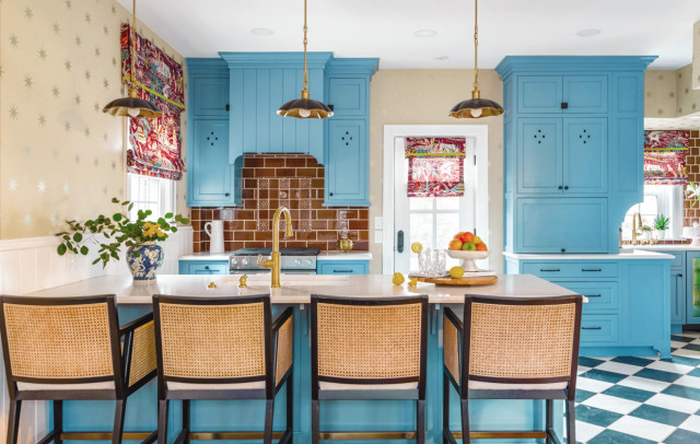
When designing her own kitchen, Cincinnati interior designer Laney Reusch began with warm tones — a light camel-colored wallpaper with metallic gold stars on it and a black-and-white checkerboard floor.
The next layer she chose was a cabinet color, where she went with a cool hue. “I flipped through my Farrow & Ball paint deck and landed on this blue. It’s not too blue, not too green, not too bright and not too dull,” she says. With the cooler color chosen, Reusch was ready to find a contrasting warm rich color for the backsplash.
Using a tile from Rookwood Pottery, a company that has been making its iconic tiles in Cincinnati for over 140 years, was on Reusch’s must-do list. So she was limited to the colors they offered. “I initially wanted a plum, but they didn’t have that color,” she says.
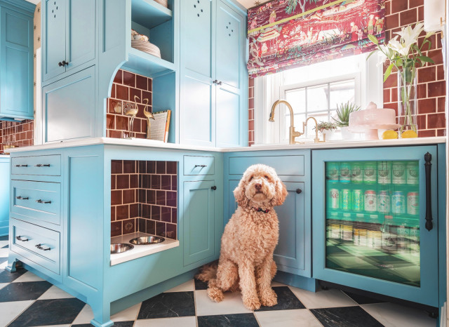
No matter, as the lack of plum led her to a wonderful alternative. “When I saw this brown, I could tell it was really warm and cozy and it wasn’t something I see everywhere,” she says. “It was rich and deep and had red undertones in it.” The blue and reddish brown are a contrasting color pairing that play beautifully off each other. The red undertones in the brown also allowed Reusch to pull plum into the palette through the fabric on the window treatments. They add another lovely layer full of rich warm colors into the space. Pictured in the kitchen is Reusch’s dog, Teddy Bear.
No matter, as the lack of plum led her to a wonderful alternative. “When I saw this brown, I could tell it was really warm and cozy and it wasn’t something I see everywhere,” she says. “It was rich and deep and had red undertones in it.” The blue and reddish brown are a contrasting color pairing that play beautifully off each other. The red undertones in the brown also allowed Reusch to pull plum into the palette through the fabric on the window treatments. They add another lovely layer full of rich warm colors into the space. Pictured in the kitchen is Reusch’s dog, Teddy Bear.


Comments
Post a Comment